The generative AI hype
Generative AI is a hot topic these days. Tools like ChatGPT, Dall-E, MidJourney, Github Copilot, Gemini are all the rage.
There are times when the hype about generative AI seems a bit too much. Many use cases work well as a demo, but fall apart under any serious workload.
Then there are times when it actually surpasses expectations and makes you question your vision of the future. Recently, I had a quick experience of the latter when I used ChatGPT to redesign a website.
AI as a web designer?
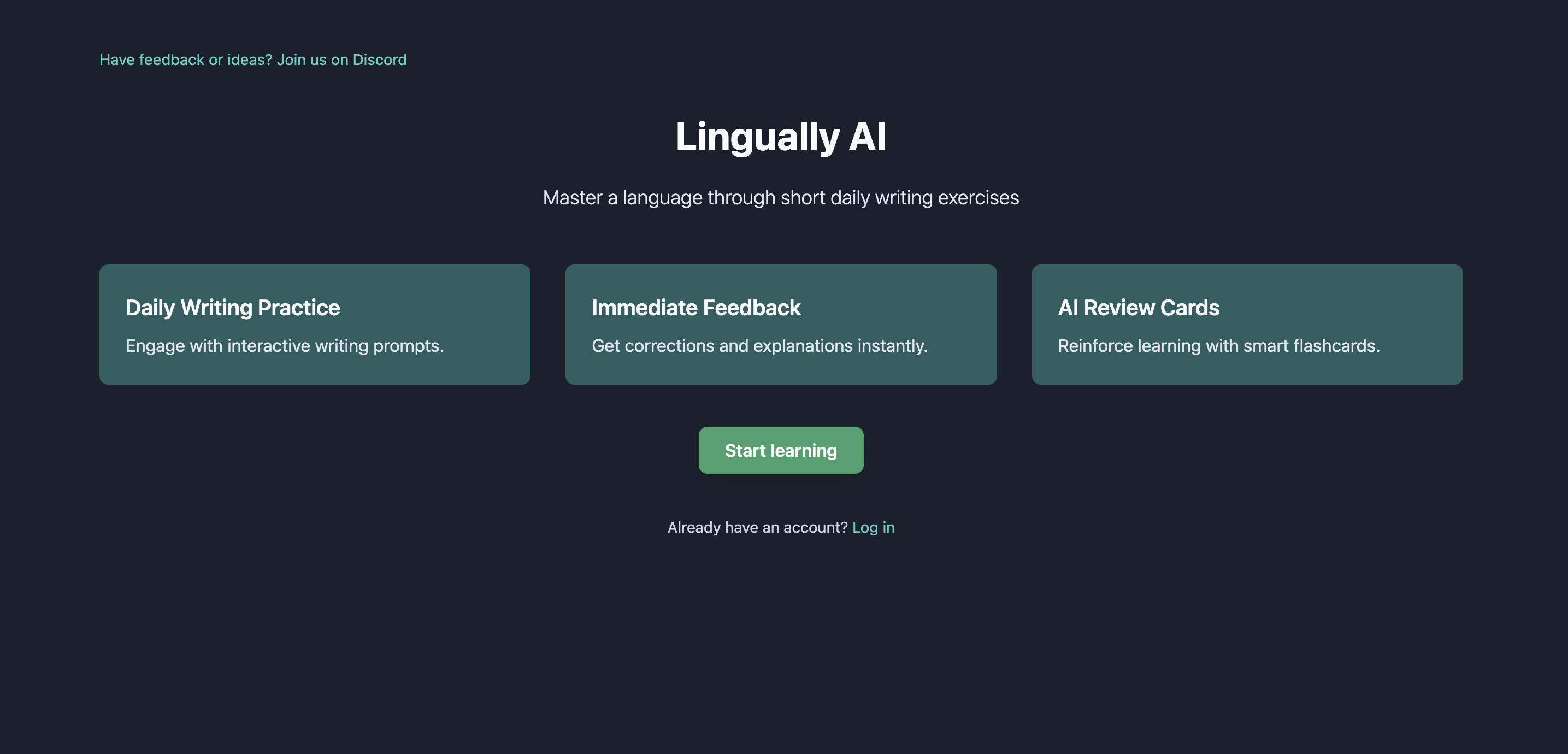
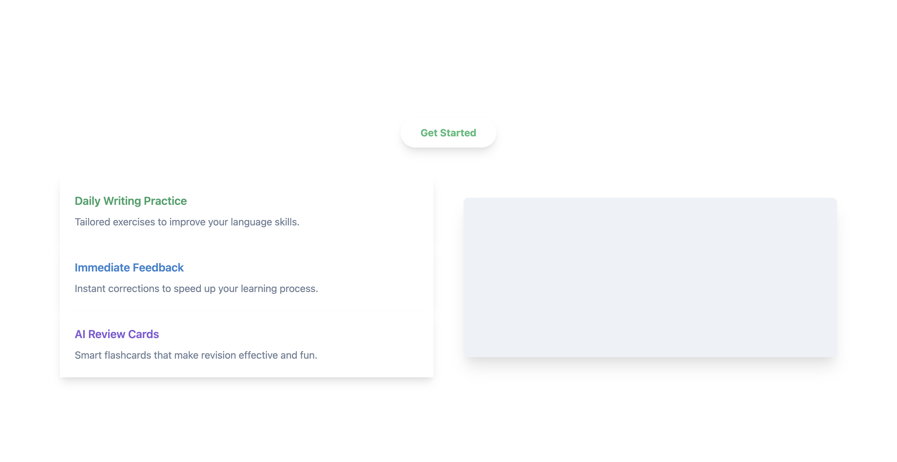
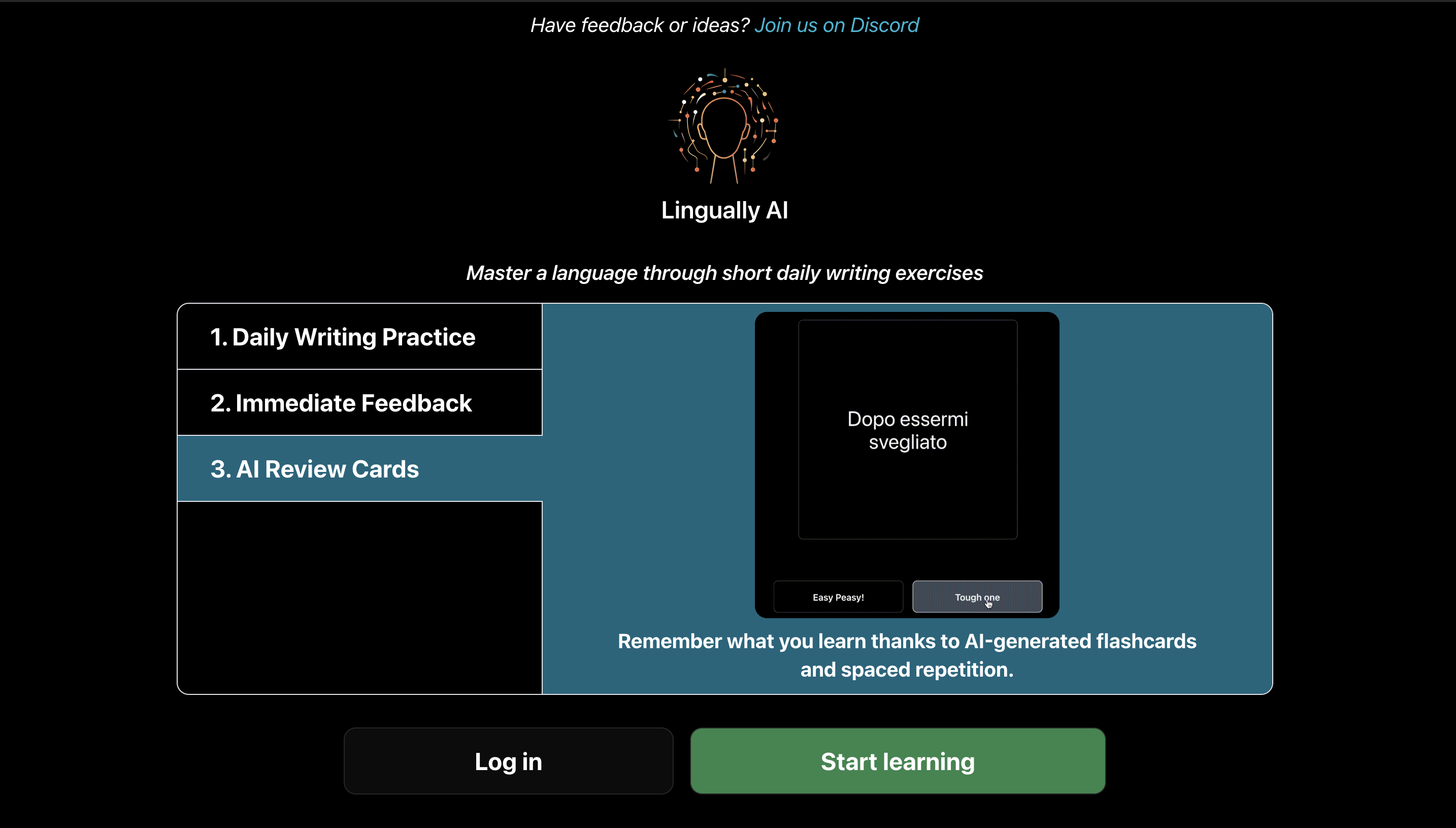
I’m not a designer. And it definitely showed when I’ve created a website for my project Lingually AI. The result was functional and not the worst page I’ve seen, but definitely left a lot to be desired. I was stuck in a local optimum though and wasn’t quite sure where to take it next without getting a designer involved.
So I decided to ask ChatGPT for some advice:
User
You are a very skilled and highly acclaimed website designer. Your task is to review an image of a website design and provide constructive feedback on how to improve it.
ChatGPT
Sure, I'd be happy to review the website design for you. Please upload the image of the website design, and I'll provide you with constructive feedback on its layout, aesthetics, user interface, and any other aspect that could be enhanced.
User
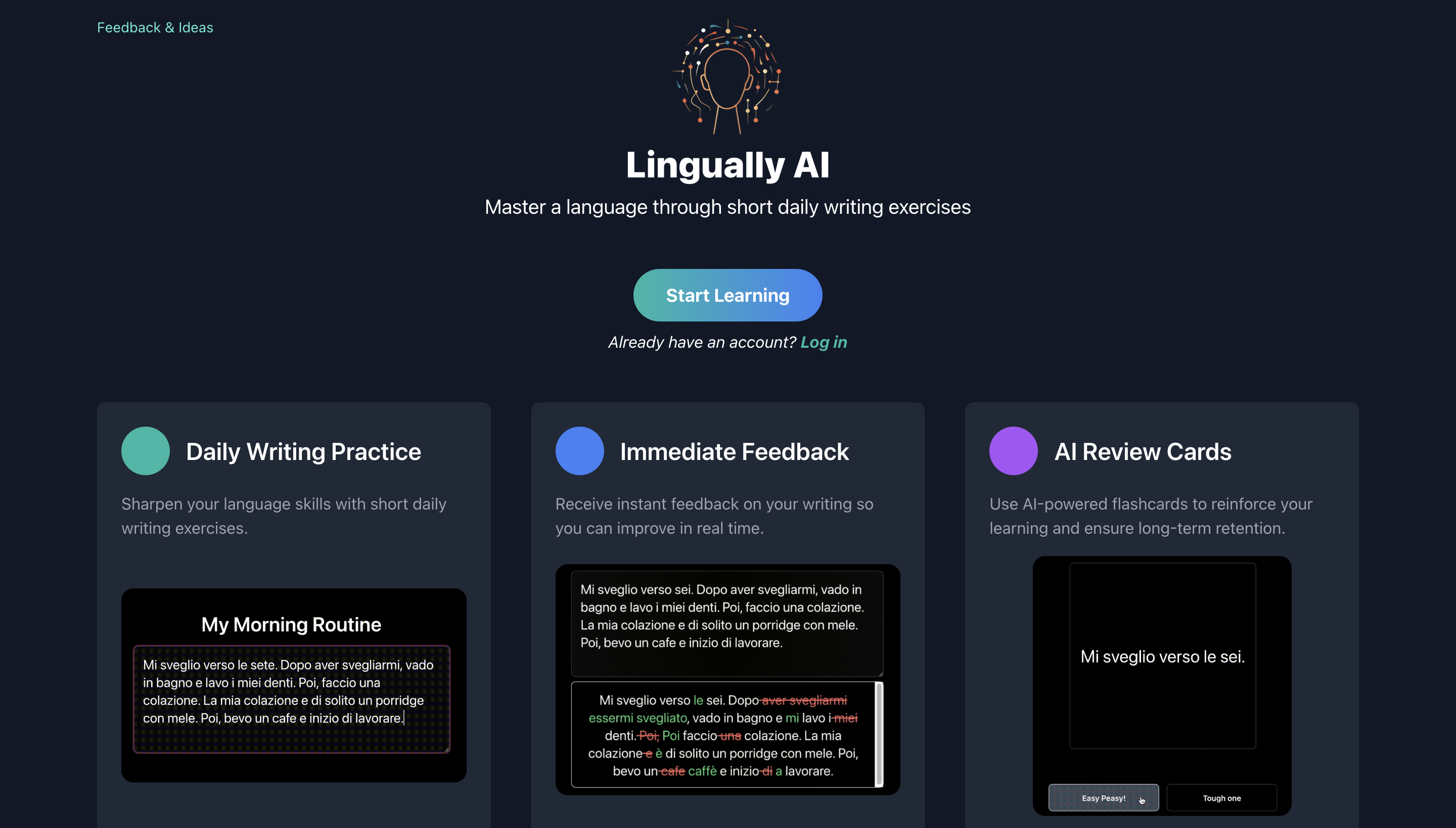
ChatGPT
Thank you for sharing the image of the website design. Here is my feedback based on the image provided:
Strengths:
- Color Scheme: The dark background with teal accents is modern and appealing. It works well for tech and educational platforms.
- Clear Call to Action: The "Log in" and "Start learning" buttons are prominent, making it clear what actions users can take.
- Simplicity: The design is straightforward and not cluttered, which is good for usability.
Areas for Improvement:
- Contrast and Legibility: The text within the teal boxes might be challenging to read for some users. Increasing contrast or choosing a brighter color for the text could improve readability.
- Visual Hierarchy: The three features ("Daily Writing Practice," "Immediate Feedback," and "AI Review Cards") seem equally important, but their presentation lacks a hierarchy that guides the user's eye. Using size, color, or additional graphical elements could help establish a flow.
- Spacing and Alignment: The elements could benefit from more balanced spacing. For example, the space above the headline "Master a language..." and the Discord link at the top seems tighter compared to the space at the bottom. Ensuring consistent spacing can enhance the overall professional look.
- Interactive Elements: The buttons under the example flashcard ("Easy Peasy!" and "Tough one") could be more descriptive. It's not immediately clear what they do.
- Engaging Imagery: While the design is clean, it might be a bit too sparse. Adding some subtle graphics or images related to language learning could make the interface more engaging.
- Information Density: There's a lot of unused space on the right side. If the website's goal is to offer language practice, there could be a short, engaging introduction or demonstration of how the practice works on the landing page.
- Responsive Design Check: Ensure that the design scales well on different devices. The current layout might present differently on mobile devices where screen real estate is limited.
- Branding: The logo "Lingually AI" blends with the background. Consider making the logo more prominent to strengthen brand recognition.
- Footer Information: There appears to be a lack of footer, which is a common place to find additional information, contact details, or navigation links.
Remember, these are starting points for refinement. It's also essential to user-test the design to gather real feedback on how potential users interact with it, as they might reveal insights not immediately apparent from an expert review.
Put some actions behind those words
That was not a bad start. Some interesting thoughts there. But critiquing is easy without actually showing how it could be better. After a quick back-and-forth, we get to some first suggestions of code compatible with Tailwind CSS.
User
What colours would you suggest for the text? Give tailwind css codes.
ChatGPT
For the text displayed on a teal background, you would want to ensure that there is enough contrast for readability while maintaining aesthetic harmony. In Tailwind CSS, you might consider the following color utilities:
- White Text: If the background is a darker shade of teal, white text often offers the highest contrast and is a safe choice for readability.
- Tailwind CSS code: text-white
- Light Gray Text: If you're looking for something softer than white but still with sufficient contrast, a light gray can work well.
- Tailwind CSS code: text-gray-200 or text-gray-300
- Yellow or Amber Text: For a bit of visual interest and high contrast, a warm yellow or amber can work well against teal, especially if it's a dark teal.
- Tailwind CSS code: text-yellow-300 or text-amber-300
- Light Blue Text: To maintain a monochromatic scheme with a teal background, a light blue can complement it nicely.
- Tailwind CSS code: text-blue-200
Here is an example of how you would apply these classes in HTML:
    <div class="bg-teal-700 p-4">
        <p class="text-white">Daily Writing Practice</p>
        <!-- Or -->
        <p class="text-gray-200">Immediate Feedback</p>
        <!-- Or -->
        <p class="text-yellow-300">AI Review Cards</p>
        <!-- Or -->
        <p class="text-blue-200">Engaging Language Learning</p>
    </div>
Keep in mind that contrast is key for accessibility, and it's important to test these color combinations to ensure they meet WCAG (Web Content Accessibility Guidelines) standards for text contrast. Tailwind CSS also provides classes for different font weights and sizes, which can further enhance readability.
User
How would you address the visual alignment and hierarchy and spacing? Help we understand and visualise what you mean
ChatGPT
Addressing visual alignment, hierarchy, and spacing is about guiding the user's eye through the content in a way that is both aesthetically pleasing and functionally clear. Here's a step-by-step approach to how I would address these elements:
- Visual Hierarchy:
- Typography: Use size and weight to establish importance. For instance, the headline "Master a language through short daily writing exercises" could be in a larger and bolder font to stand out as the most important element.
- Color: Differentiate elements by using color strategically. Important buttons or calls to action could use a more vibrant shade from the existing color palette.
- Alignment:
- Grid System: Implement a grid system to align elements consistently. This can be done using Tailwind CSS's grid classes.
- Consistency: Ensure that all elements align to the same vertical and horizontal lines. For example, the "Log in" button, the headline, and the three feature blocks could start at the same horizontal alignment.
- Spacing:
- Padding and Margins: Adjust padding and margins to give each element breathing room. Consistent space between elements can create a cleaner layout.
- Whitespace: Use whitespace to separate different sections. For example, increase the space between the headline and the feature blocks.
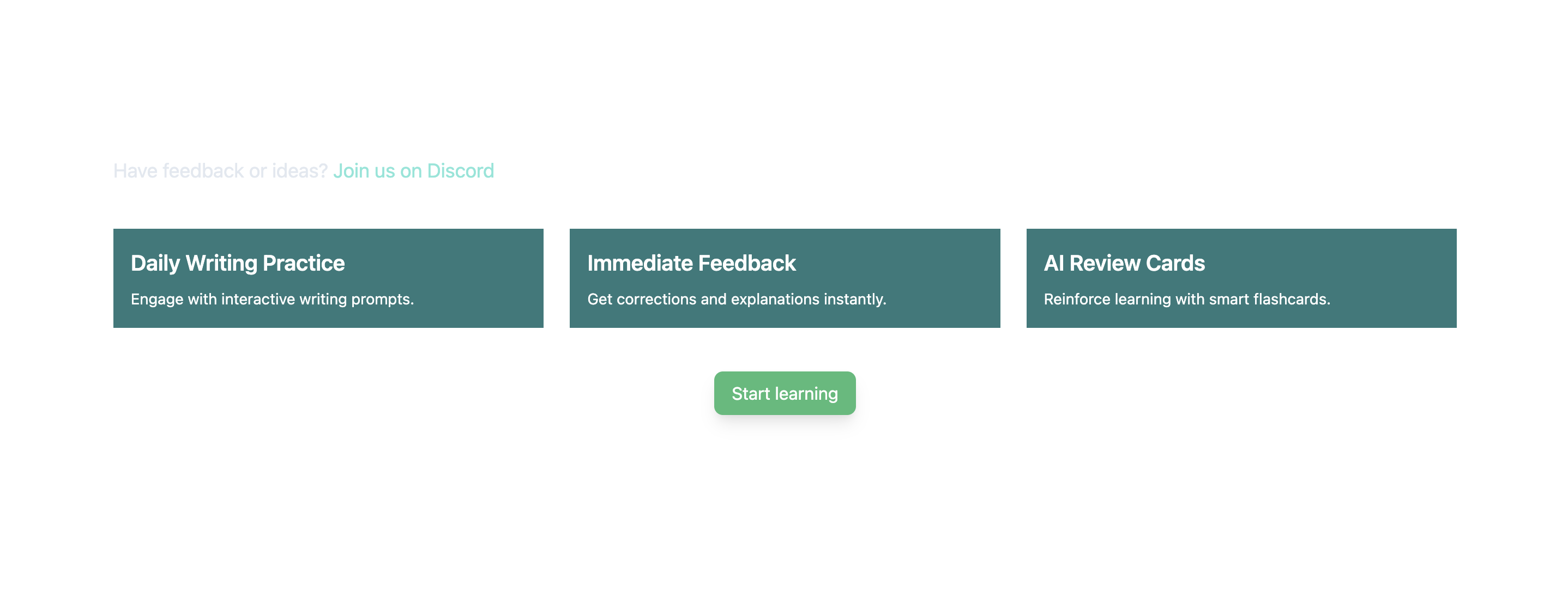
Example Refinements in Tailwind CSS:
Here's how you might write the classes in Tailwind CSS to address these points: (view in CodePen)
    <div class="container mx-auto p-6">
        <div class="flex justify-between items-center mb-10">
            <div class="max-w-xl">
                <h1 class="text-4xl font-bold text-white mb-3">Master a language through short daily writing exercises</h1>
                <p class="text-lg text-gray-300">Have feedback or ideas? <a href="#" class="text-teal-300">Join us on Discord</a></p>
            </div>
            <div>
            <!-- Logo or other elements -->
            </div>
        </div>
        <div class="grid grid-cols-1 md:grid-cols-3 gap-6">
            <div class="bg-teal-700 text-white p-4">
                <p class="text-xl font-semibold mb-2">Daily Writing Practice</p>
                <p class="text-sm">Engage with interactive writing prompts.</p>
            </div>
            <div class="bg-teal-700 text-white p-4">
                <p class="text-xl font-semibold mb-2">Immediate Feedback</p>
                <p class="text-sm">Get corrections and explanations instantly.</p>
            </div>
            <div class="bg-teal-700 text-white p-4">
                <p class="text-xl font-semibold mb-2">AI Review Cards</p>
                <p class="text-sm">Reinforce learning with smart flashcards.</p>
            </div>
        </div>
        <div class="flex justify-center mt-10">
            <a href="#" class="bg-green-500 text-white py-2 px-4 rounded-lg shadow-lg hover:bg-green-600">Start learning</a>
        </div>
    </div>
Visualisation:
- The headline is now larger and bolder, clearly indicating it's the primary focus.
- There is a generous margin below the top navigation and above the headline to create a clear visual break.
- Feature blocks have consistent sizing and spacing, with bold titles to draw attention and brief descriptions in a smaller font size to maintain hierarchy.
- The "Start learning" button is centered and given prominence, making it clear it's the next step for users.
These changes would make the design more visually appealing and functionally clear, creating a natural flow that leads the user from the introduction to the main features and finally to the call to action.
Eh, you sure about that, mate?
The previous interaction ended in a first result, but, honestly, it’s a far cry from any serious design, so let’s continue.
User
This is what I got from your code. I don't think it looks very good, are you sure this is what you were trying to produce? Can you improve the code please?
ChatGPT
The provided screenshot shows that the elements have been laid out in a row, which may not be visually appealing due to the stretched appearance of the feature blocks. Let's refine the Tailwind CSS code to improve the layout, hierarchy, and spacing.
Here's an improved version of the Tailwind CSS code: (view in CodePen)
    <div class="container mx-auto p-6">
        <!-- Top navigation and headline -->
        <div class="text-center mb-12">
            <p class="text-lg text-gray-300 mb-4">Have feedback or ideas? <a href="#" class="text-teal-300 hover:underline">Join us on Discord</a></p>
            <h1 class="text-4xl font-bold text-white leading-tight">Master a language through short daily writing exercises</h1>
        </div>
        <!-- Feature blocks -->
        <div class="grid grid-cols-1 md:grid-cols-3 gap-6 mb-12">
            <div class="feature-block">
                <h2 class="text-2xl font-semibold text-white mb-2">Daily Writing Practice</h2>
                <p class="text-white opacity-75">Engage with interactive writing prompts.</p>
            </div>
            <div class="feature-block">
                <h2 class="text-2xl font-semibold text-white mb-2">Immediate Feedback</h2>
                <p class="text-white opacity-75">Get corrections and explanations instantly.</p>
            </div>
            <div class="feature-block">
                <h2 class="text-2xl font-semibold text-white mb-2">AI Review Cards</h2>
                <p class="text-white opacity-75">Reinforce learning with smart flashcards.</p>
            </div>
        </div>
        <!-- Call to action button -->
        <div class="text-center">
            <a href="#" class="bg-green-500 text-white font-semibold py-3 px-6 rounded-lg shadow-lg hover:bg-green-600 focus:outline-none focus:ring-2 focus:ring-green-500 focus:ring-opacity-50">Start learning</a>
        </div>
    </div>
    <style>
        /* Additional styling if needed */
        .feature-block {
        background-color: #064E3B; /* Tailwind color teal-900 */
        padding: 2rem;
        border-radius: 0.5rem;
        box-shadow: 0 10px 15px -3px rgba(0, 0, 0, 0.1), 0 4px 6px -4px rgba(0, 0, 0, 0.1);
        }
    </style>
Modifications Made:
- The headline is centered and given more space to stand out.
- Feature blocks have been designed with more padding and a box-shadow for depth, which should make them more visually appealing.
- The call-to-action button is larger, centered, and has additional focus styles for accessibility.
- Custom CSS styles are added for the feature blocks to ensure they have a consistent and distinct look.
This code should create a more balanced and visually appealing layout with clearer visual hierarchy and better spacing. If you apply this code to your project, it should improve the design significantly.
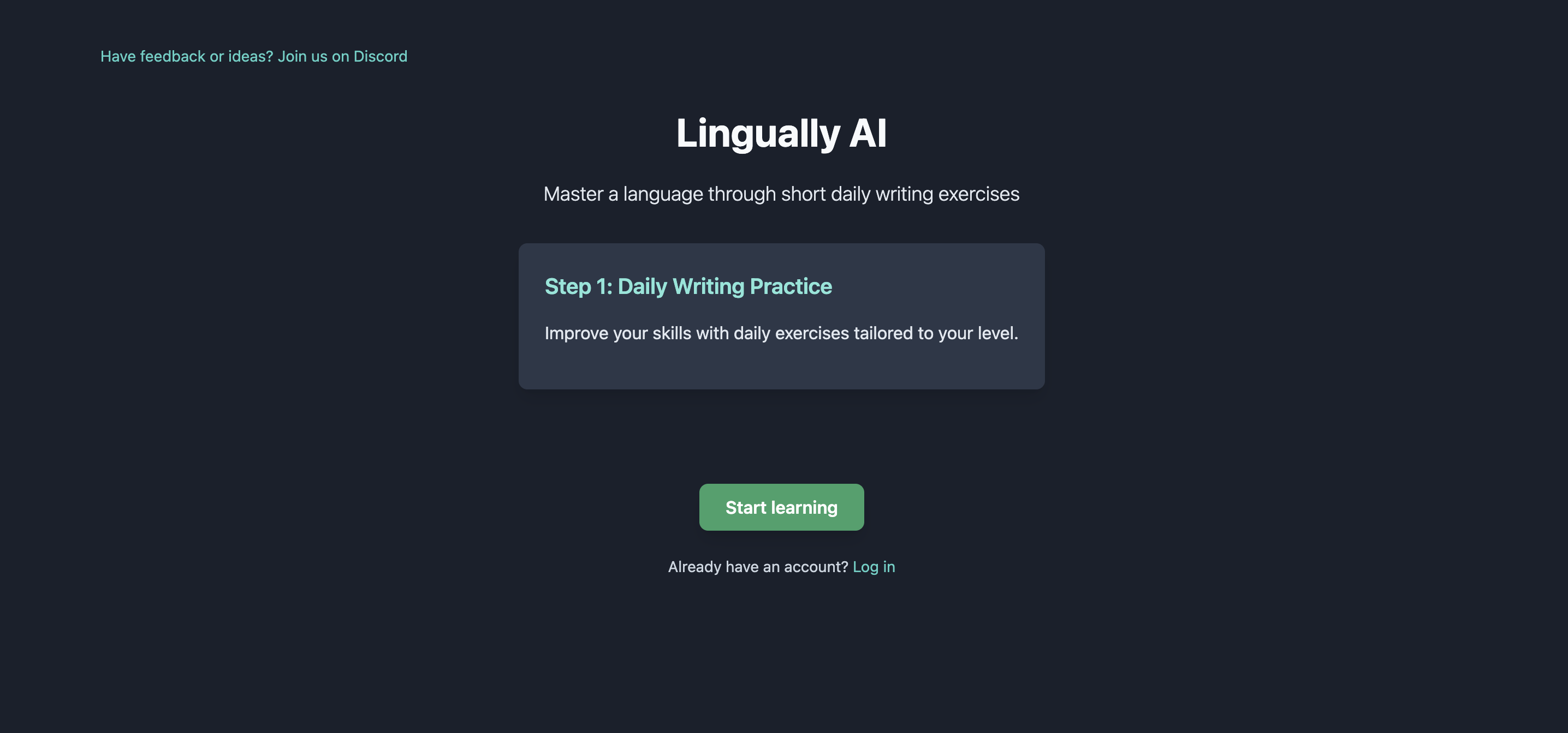
As you see in the first picture below, it’s still nothing to write home about. Mainly, I prefer dark themes (as seen in the original design). Plus, it missed out on all of the information previously included on the site.
It took a few iterations to move forward. For brevity, from here onwards I’ll only include my prompts and the CodePens containing the ChatGPT-generated code. I will leave out any of the chat fluff.
User
It now looks like this. You're missing a lot of the information that was there in the original design. I also prefer the dark theme of the original design. Can you fix these?
User
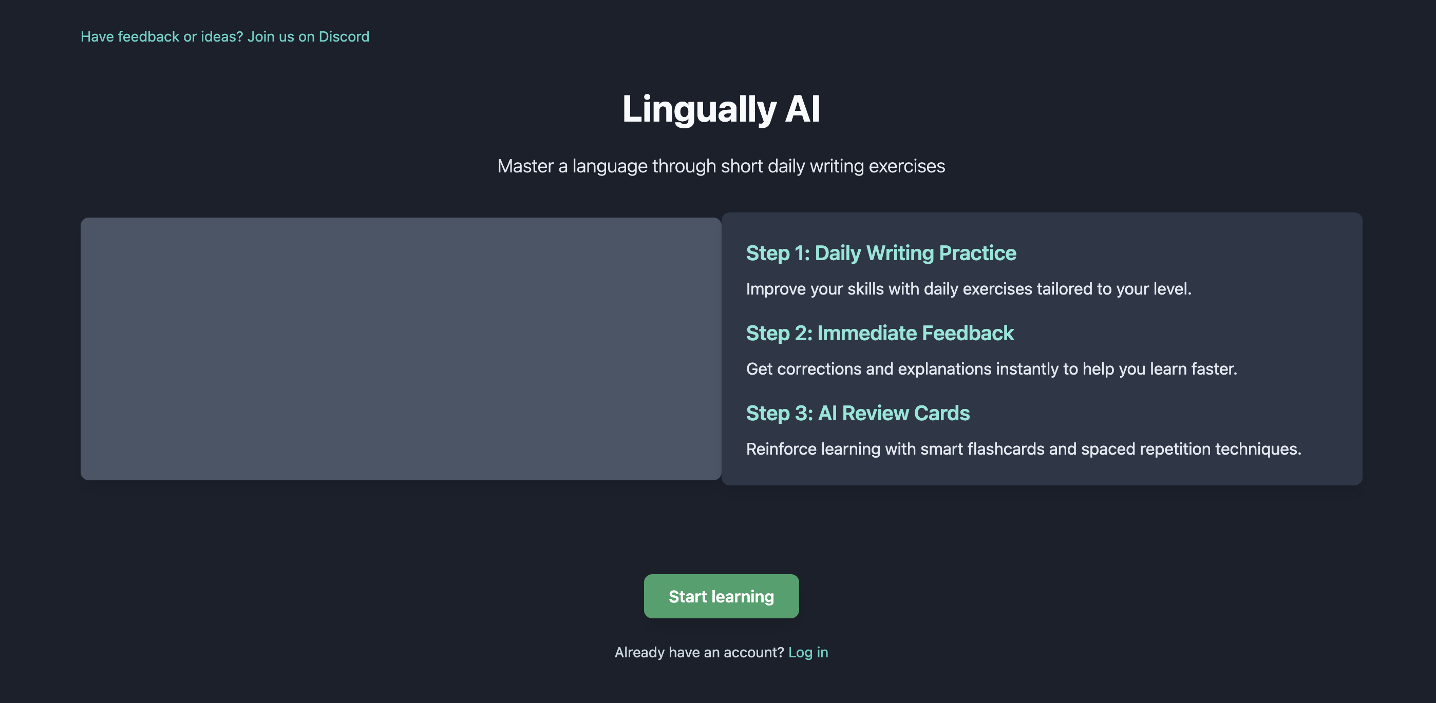
There's still the main part with the information about how each of the steps works missing. In the original design, the main content cycles through the 3 steps and shows relevant information. How would you make space for that in this design?
User
Add all 3 steps there please. And make room for an image for each of the steps, like there was in the original design.
Getting inspired
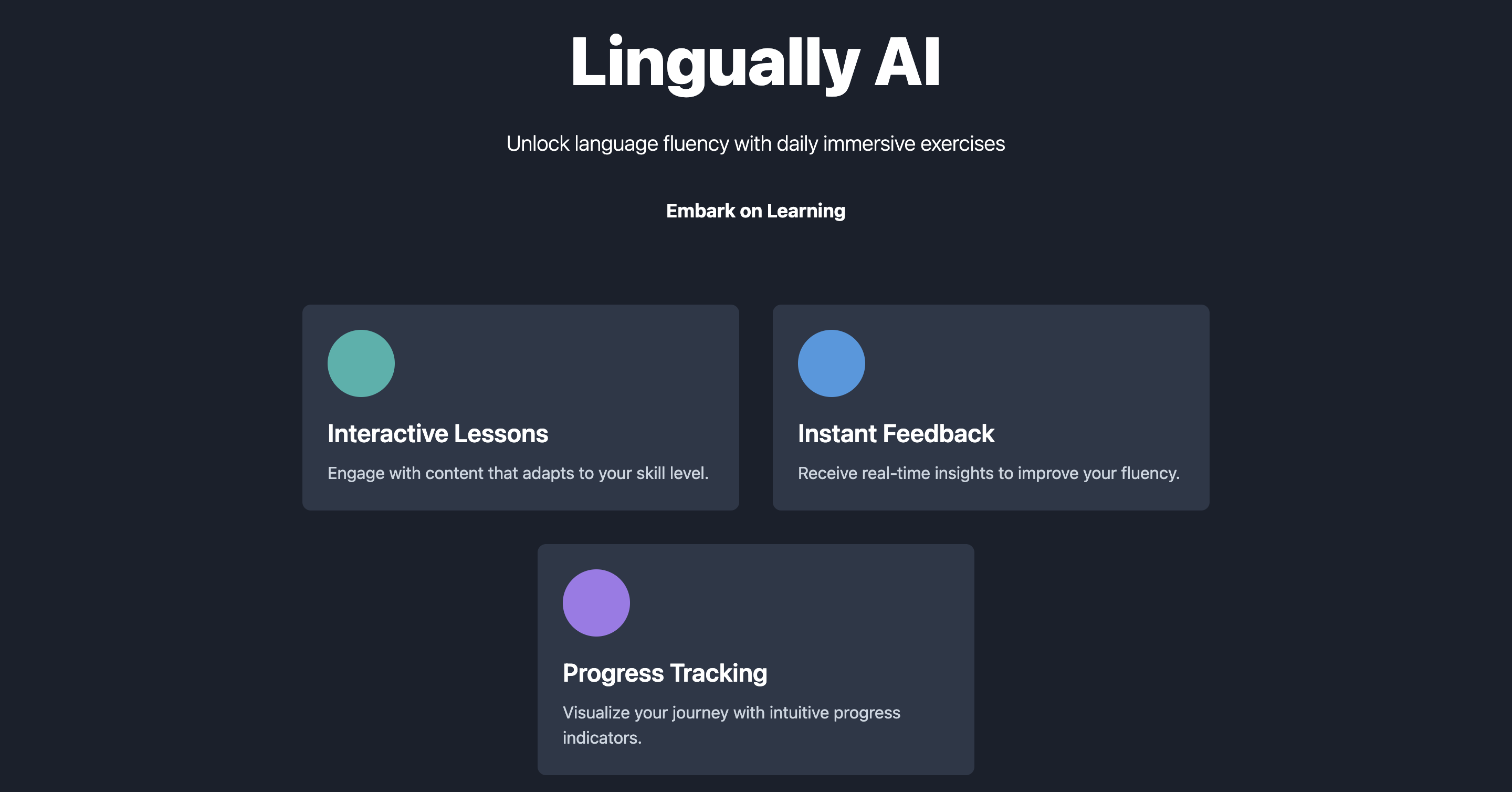
The site is starting too look alright, but still seems incredibly dull. Let’s see if ChatGPT can improve on this further or this is the best it’s got.
User
It looks alright now. But the design is quite dull and basic. This is not something an acclaimed designer would produce. I know you can do better than this! Make it more appealing, catchy, chic.
User
Still quite dull somehow. Take a look at something like Duolingo and it is just so much more visually interesting. And not just because of the images. Try harder and really make the design pop!
Want better results? Show some encouragement!
With all these iterations still not getting me where I wanted, I resort to something else. I go ahead and treat the AI with compassion, encouragement, trust.
User
Nope! I don't want you to create a site that looks like Duolingo. I want you to stick to the original dark theme design you had earlier, but make it pop, make it playful, make it worthy of an acclaimed and skilled web designer that you are! You got this
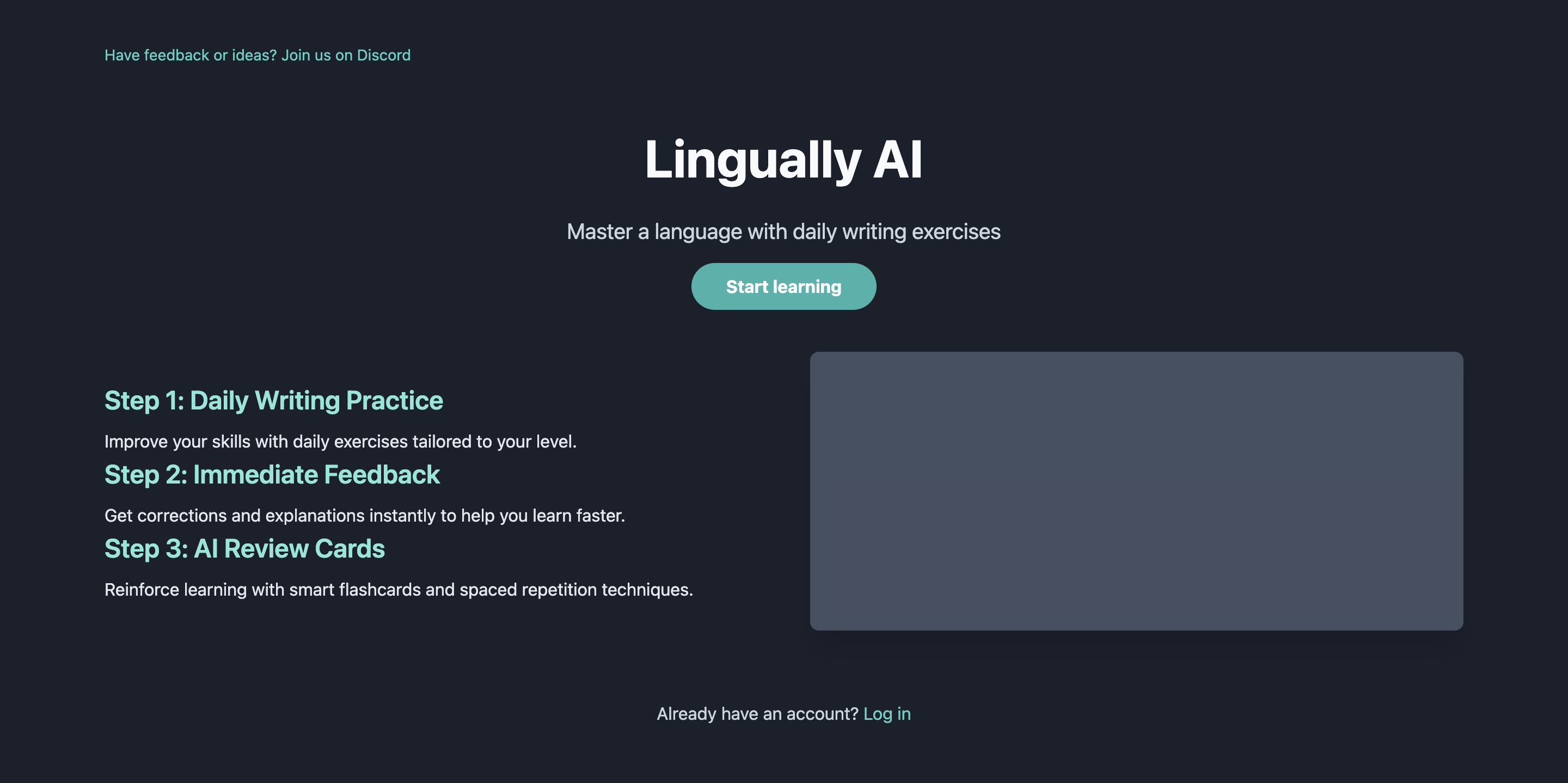
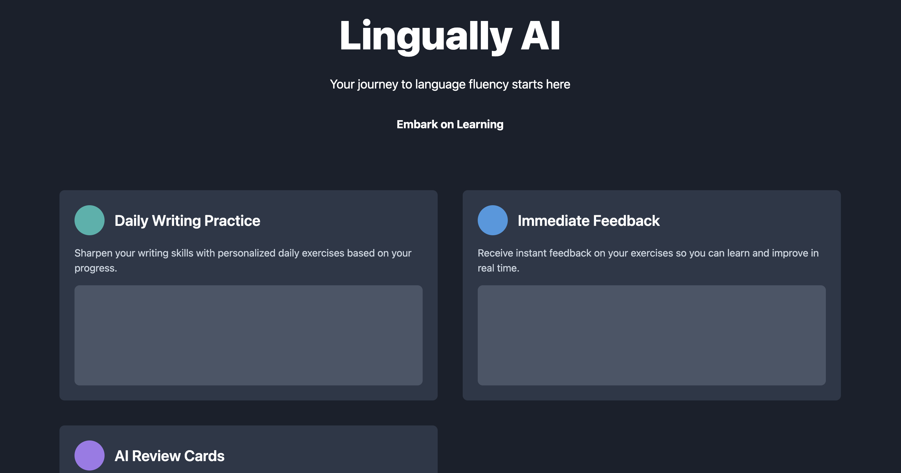
Eureka! Let’s just fix a couple of small things.
Finally! This is the first design that I think looks really solid. A few things need tuning, but I’m impressed at this point. Let’s just drive this home now!
User
Ok, now we're getting somewhere! I love the new fonts and colors etc! Great job! Can you make the 3 steps all underneath with a place next to them to show some text and an image?
User
Ok, that's a bit different to what I though, but could work. Perhaps put all 3 cards next to each other?
User
Can you add back in the coloured circles? I really liked those and they're gone now.
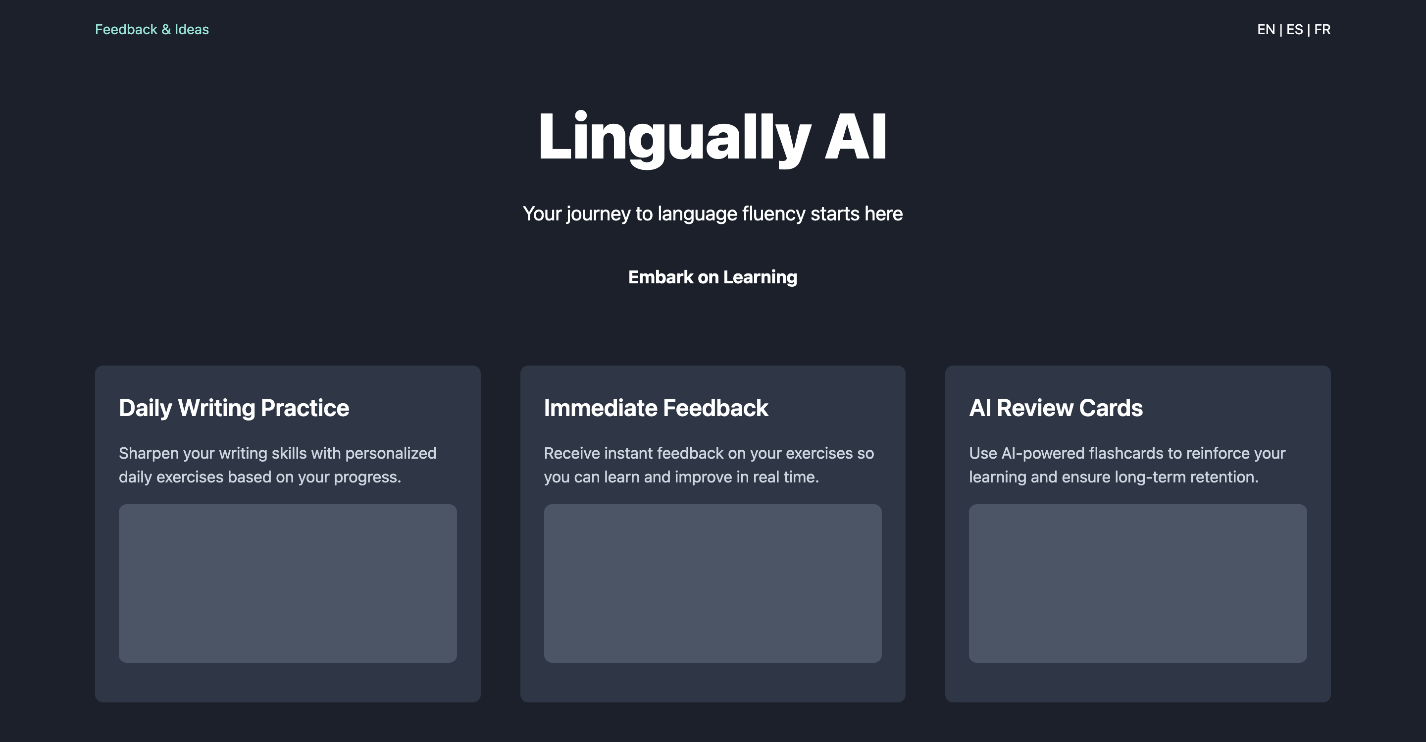
And that’s it, at this point I decide I’m really happy with the design, and I go off to implement it.
Summary
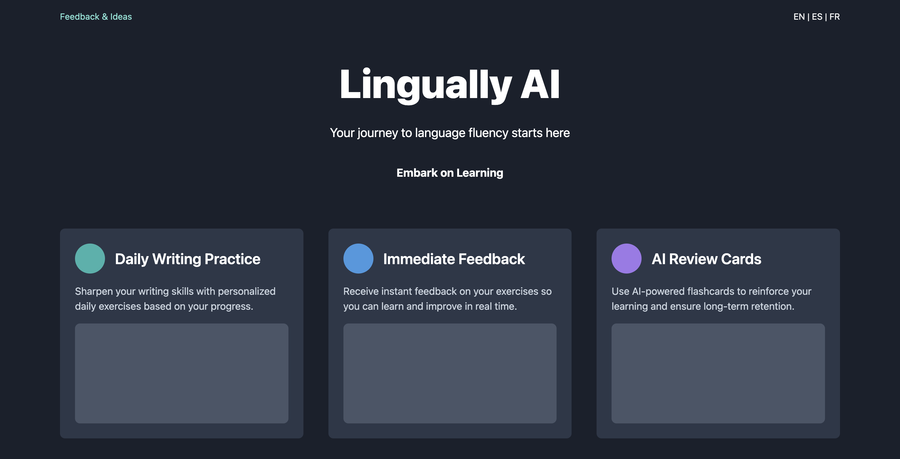
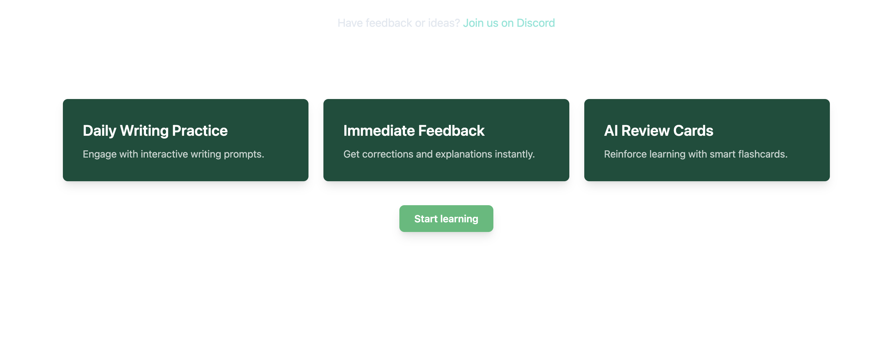
So here you have it. Thanks to ChatGPT I went from this:
To this:
Overall, I’m very impressed by the result. I did not expect it to work this well with this little input. Especially, I’m mindblown that:
- ChatGPT produced 100% correct HTML code at every single step. Plus it used the Tailwind CSS library exactly as instructed. This is rather incredible and I can completely see using ChatGPT as a front-end helper.
- The visual input processing is rather remarkable. Not only it was able to reason about user interface / experience. It also managed to understand the text from the image and include the phrases used in the new design.
I think there is definitely a potential in this kind of use for LLMs. I’d love to have an LLM agent work on the background as I code my projects and create this kind of very reasonable design for sites I produce. And I have a feeling this will be the reality very very soon.